Over 10 weeks this summer, collaborators in the Data to Discovery (D2D) program explored new ways to represent data from computational models of Earth’s climate systems. At the end of the program, the team presented prototypes for interactive tools—named CliMAScope and CLOVE—which enable researchers to gain new scientific insights from their data while also serving as a springboard for artistic inquiry.
A Unique Collaboration
Now in its 12th year, D2D is organized by a team of faculty and leaders in data visualization across Caltech, JPL, and ArtCenter. Each year, the organizers select two to three proposals from Caltech and JPL research groups to engage in a collaboration. They then hire three to five student interns with backgrounds in design and programming to spearhead the visualization projects over the summer.
“What we look for are projects that we know have really interesting data with strong visual exploratory potential,” says Santiago Lombeyda, senior computational scientist in Caltech’s Center for Data-Driven Discovery and one of D2D’s co-organizers. “We want to know that there’s going to be a need for some type of tool and a community that will use it.”
This year, the selected proposals both sought to represent complex data generated by models of Earth’s climate systems. One proposal, from the group of JPL research scientist Anthony Bloom, focused on the carbon data model framework (CARDAMOM), which models the earth’s carbon cycles. The other proposal, from researchers in the Climate Modeling Alliance (CliMA) led by Tapio Schneider, the Theodore Y. Wu Professor of Environmental Science and Engineering, and Alexis Renchon, associate research software engineer, focused on CliMA’s Land model, which models vegetation processes and remote-sensing data.
A hallmark of the D2D program is the methodology the team uses to develop visual approaches. Rather than planning a specific tool or solution from the get-go, the interns and organizers work to understand the existing ways researchers interact with their data and then co-design, iterate, and test prospective solutions in close collaboration with the researchers.
“I’d liken it to speaking multiple languages with others who also speak multiple languages,” says intern Linh Pham on the collaborative process between designers, programmers, and researchers. “Depending on how fluent we are in each language, there may be limits on how much we can communicate. However, when everyone has a good grasp of various disciplines, the ideas we can explore together become more than the sum of their parts.”
This methodology, based in radical participatory design and human–computer interaction research, is more than just a way to ensure the end users are satisfied with the tools that are developed. It also opens the door for artistic inquiry into the process of creating and interpreting meaning in visual information.
“When we’re ideating, I get most interested when we see something that isn’t what we would expect,” says Hillary Mushkin, Research Professor of Art and Design in Engineering and Applied Science and the Humanities and Social Sciences at Caltech and co-organizer of the D2D program. “There are certain kinds of diagrams that are very familiar, that are used often in data visualization because they’re tried and true. But sometimes we end up hitting upon things that are weird and radically different.”
Mushkin says those innovative visual approaches may elicit visceral reactions from viewers, which, in turn, illuminate something more fundamental about the intuitive and embodied nature of visualization.
“This becomes an opportunity to explore form in visualization and how we make meaning through form and interaction,” Mushkin says. “At what point does something become meaningless or meaningful?”
In August, the intern cohort shared its work in a final presentation to the D2D organizers, researchers, and other attendees. They discussed the design process and demonstrated prototypes for two new interactive data visualization tools.
CliMAScope
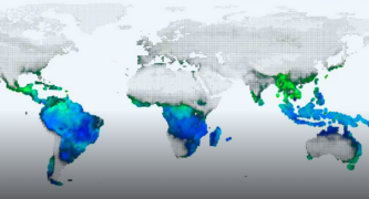
Working with researchers at CliMA, the D2D team created CliMAScope, an interactive tool that visualizes data from CliMA’s Land model. The CliMAScope interface features a world map with data points represented as colored spheres and has several features to facilitate the comparison of data across variables, between models, and between model outputs and observational data.
For the prototype, the interns visualized two key variables—leaf area index (LAI), a measure of leaf coverage of the ground, and gross primary productivity (GPP), which quantifies the energy plants produce through photosynthesis—using a blended color spectrum. Higher LAI values were represented by green spheres, while higher GPP values were shown in blue. The intersection of high values for both LAI and GPP resulted in teal shades, while lower values for both variables were displayed in shades of black, illustrating relatively low leaf coverage and productivity.

Credit: Linh Pham
CliMAScope also includes a temporal analysis window with a time slider, radial plot, and time series graph to illustrate changes in data over time, which are especially relevant to the CliMA models. Both GPP and LAI variables typically fluctuate across seasons, and longer-term changes may reveal human impacts on climate.
The tool has other features that allow researchers to zoom in on specific regions of the map; create thresholds so that only data within a specific range of values will be visualized; or add other information layers to contextualize data, like land elevation or latitude and longitude.
After seeing the demonstration of CliMAScope, Schneider expressed his excitement for the tool created for his research group.
“We are dealing with complex data and complex processes,” Schneider said at the presentation. “The diagrams we work with are very hard for scientists to parse and nearly impossible for the rest of the world. I think there’s true visual genius to finding simple, clear ways of representing relations among variables and developing these tools. It’s impactful both for making the science more effective but also for communicating the science more broadly.”
CLOVE
Working with researchers in Anthony Bloom’s group at JPL, the D2D interns created CLOVE to visualize outputs from the carbon data model framework (CARDAMOM), which models the earth’s carbon cycle. One of the challenges the team faced was visualizing high-dimensional data with more than 100 variables. To best illustrate the intricate relationships within the data, they integrated several different interactive visualization methods into CLOVE.
One section within CLOVE shows an animated tree diagram representing carbon pools, or different places carbon is stored. The tree diagram is made up of sections of moving particles that represent carbon pools like foliage, wood, roots, and soil. The speed of the particles indicates the turnover rate of carbon within each pool, allowing researchers to develop an intuitive understanding of how long carbon resides within different pools.
Another tab within CLOVE features shell and medal diagrams where each carbon pool is visualized as a node, with arrow arcs indicating fluxes, or the movement of carbon across pools. While the shell diagram shows the fluxes between each pool distinctly, the medal diagram visually groups pools into overarching categories of live biomass, dead organic matter, and atmosphere, demonstrating broader flux patterns. Different colored arrows indicate the type of process behind each flux: production (photosynthesis), respiration, decomposition, fire, or disturbance (human-induced carbon flux).
The last feature in CLOVE utilizes a flower-shaped plot to help researchers quantify and compare the amount of carbon flux in different processes. The flower plot has a petal to represent each process; the size of each petal signifies the amount of carbon fluxed. The flower plots can also be viewed in a “garden” layout with several flowers lined up to show the changes in data over time and reveal seasonal patterns and other trends.
“I think we learned more from you than you from us in the process,” Bloom said after the group’s presentation of CLOVE. “I have to say, the amount of input that we gave you feels so little compared to the amazing work you’ve done in a matter of weeks. It was an absolute pleasure working with you.”
Future Development
Although the summer program came to an end after 10 weeks, the prototypes will likely continue to be developed by the D2D organizers and collaborators. Many previous D2D projects have received follow-on funding, and some have resulted in the part-time or full-time hire of interns to continue working on the tools. Several projects have also grown into research publications or conference papers in fields across the sciences and humanities.
“One of the reasons we started this program was because different scientific disciplines often come with a series of conventions about how to answer questions,” said Scott Davidoff, senior manager of user experience research and design at JPL and D2D co-organizer, at the presentation. “We don’t embody that background or bring that same set of assumptions. So, introducing art and design adds an interesting and destabilizing function, where you can be a lot more generative while also evaluating those ideas. I think that’s one of the elements that makes the outcomes from this particular program successful.”
The D2D program is co-organized by Hillary Mushkin; Santiago Lombeyda; Scott Davidoff; Krys Blackwood, principal user experience designer at JPL; Maggie Hendrie, dean of the division of media and technology at ArtCenter; and Jenny Rodenhouse, associate professor and chair of interaction design and faculty director of the Immersion Lab at ArtCenter. This summer’s intern cohort included Linh Pham and Kevin Hu, both from Harvard’s Master in Design Engineering program, and Nathan White, a PhD candidate in human–computer interaction at the University of Wisconsin-Madison. They were joined by Min Joo, a graduate student at ArtCenter who supported the projects as an external collaborator.
Artwork and data visualization projects from D2D will be on display as part of Getty’s PST ART event at both Caltech and ArtCenter beginning in late September. D2D work can be seen in Caltech’s Crossing Over: Art and Science at Caltech, 1920–2020 exhibition in the Powers of Ten gallery in Dabney Lounge on campus. Other work will be on display in ArtCenter’s Seeing the Unseeable: Data, Design, Art exhibition.

Credit: Julia Ehlert/Caltech


